© 2024 Dual Up Consulting. All rights reserved.


A group of promoters challenged iupi to create a Brand that would stand out in the tourism activities market, capturing the essence of inspiring and challenging trips.
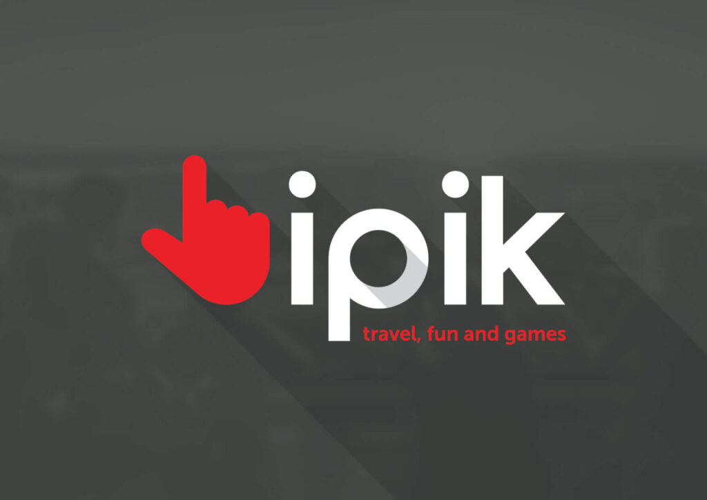
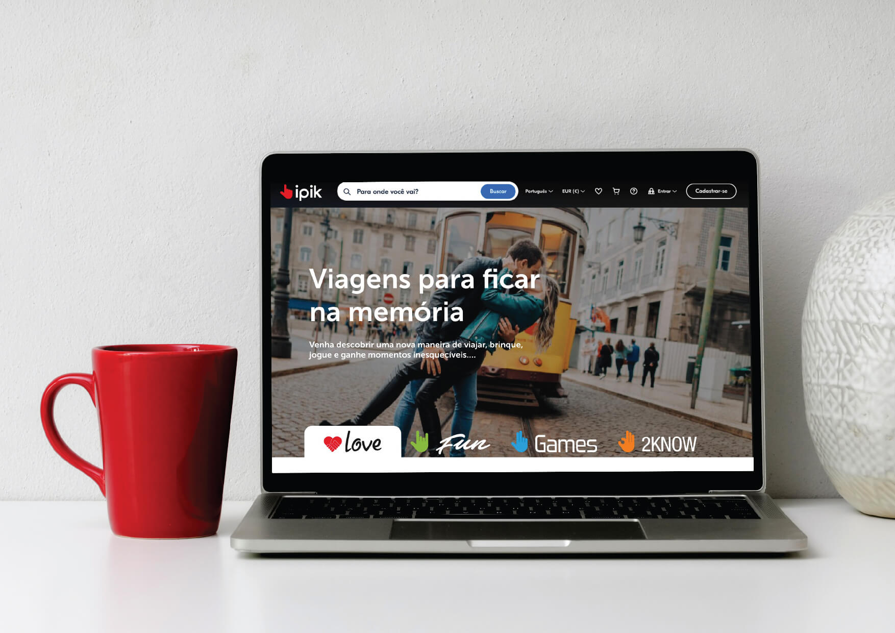
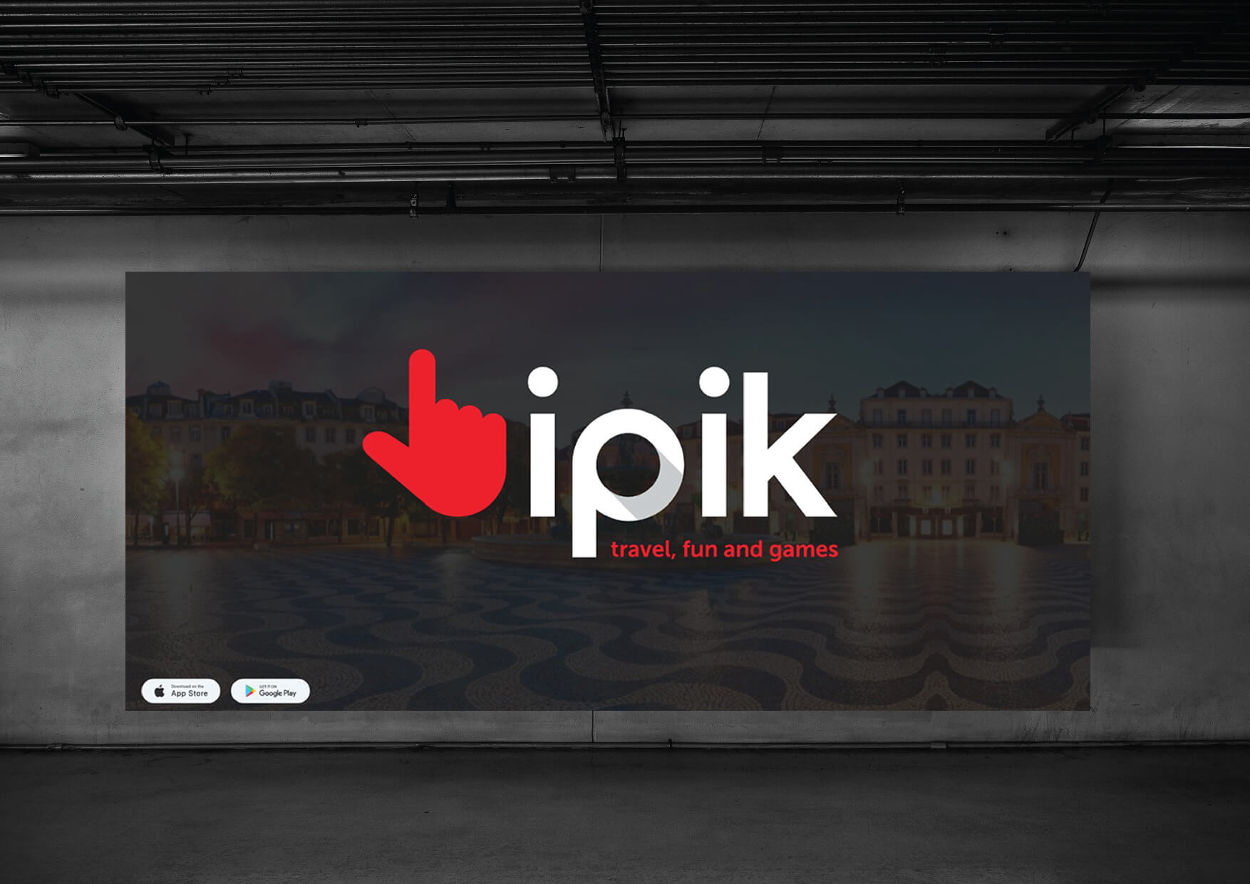
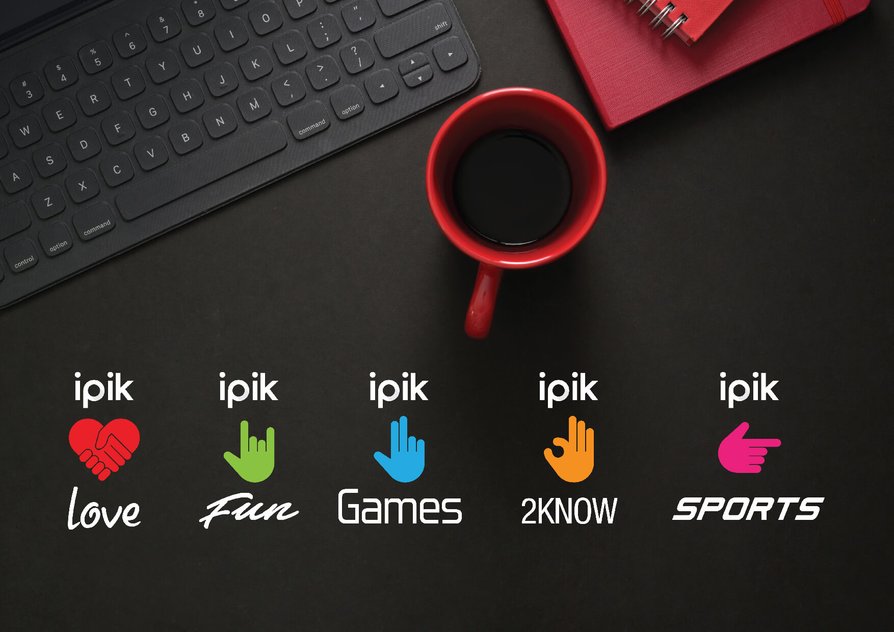
iupi accepted the challenge of creating an identity that communicated the Brand’s values and could stand out in this competitive market. The name “ipik,” inspired by the expression “I choose,” was created to reflect the personalization and unique choice that today’s customer demands.
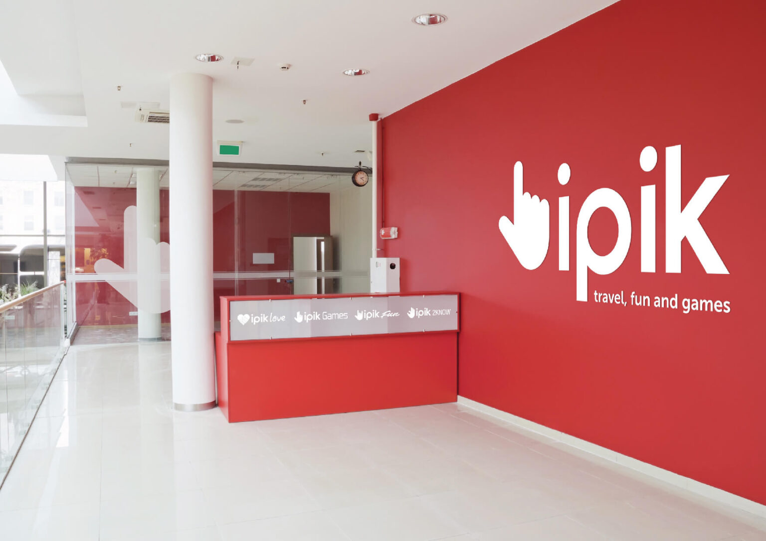
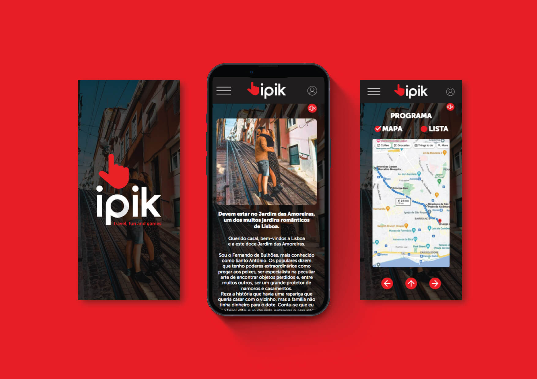
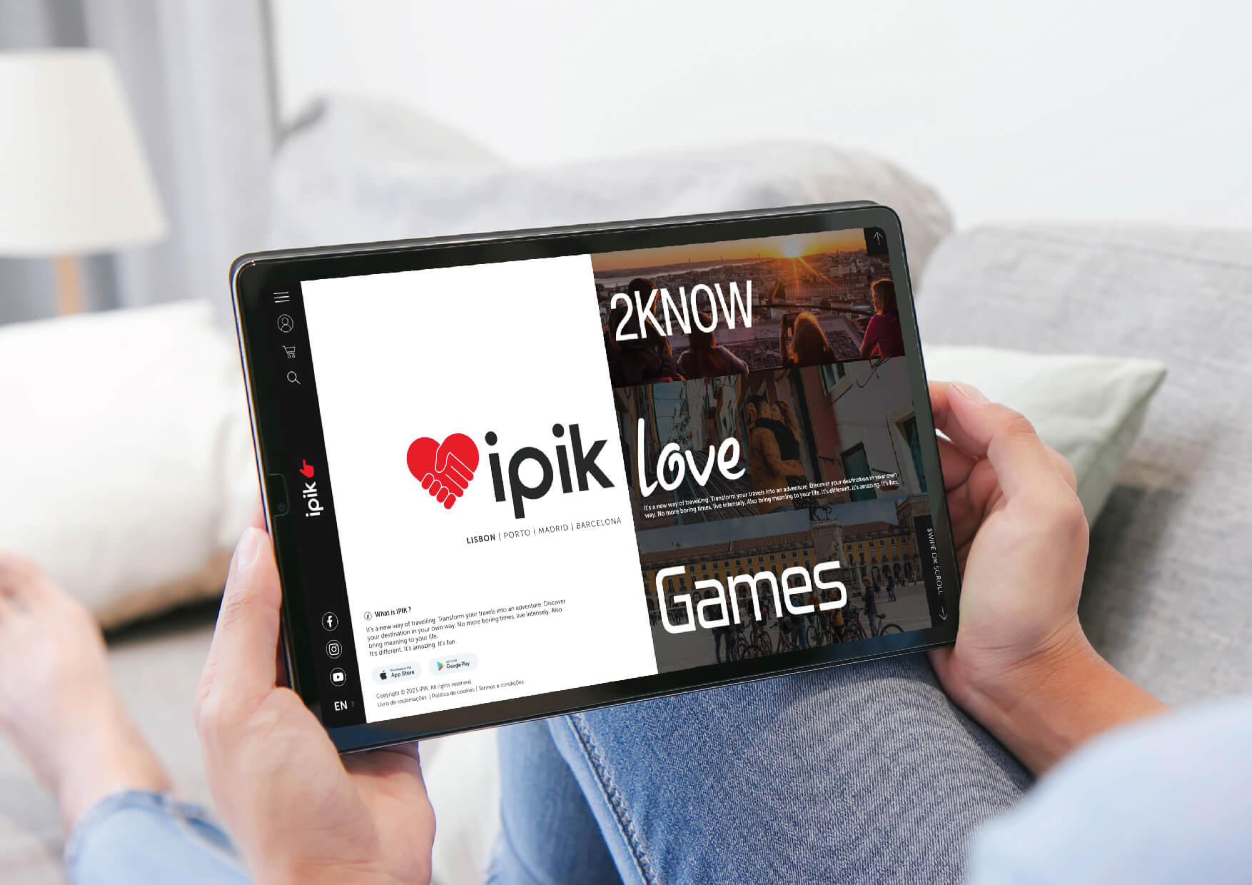
The visual identity was focused on the hand being the main position in the self, and for each program a different finger position. The color palette is based on black and red, high-contrast colors that allow for variations in other colors depending on the product family.
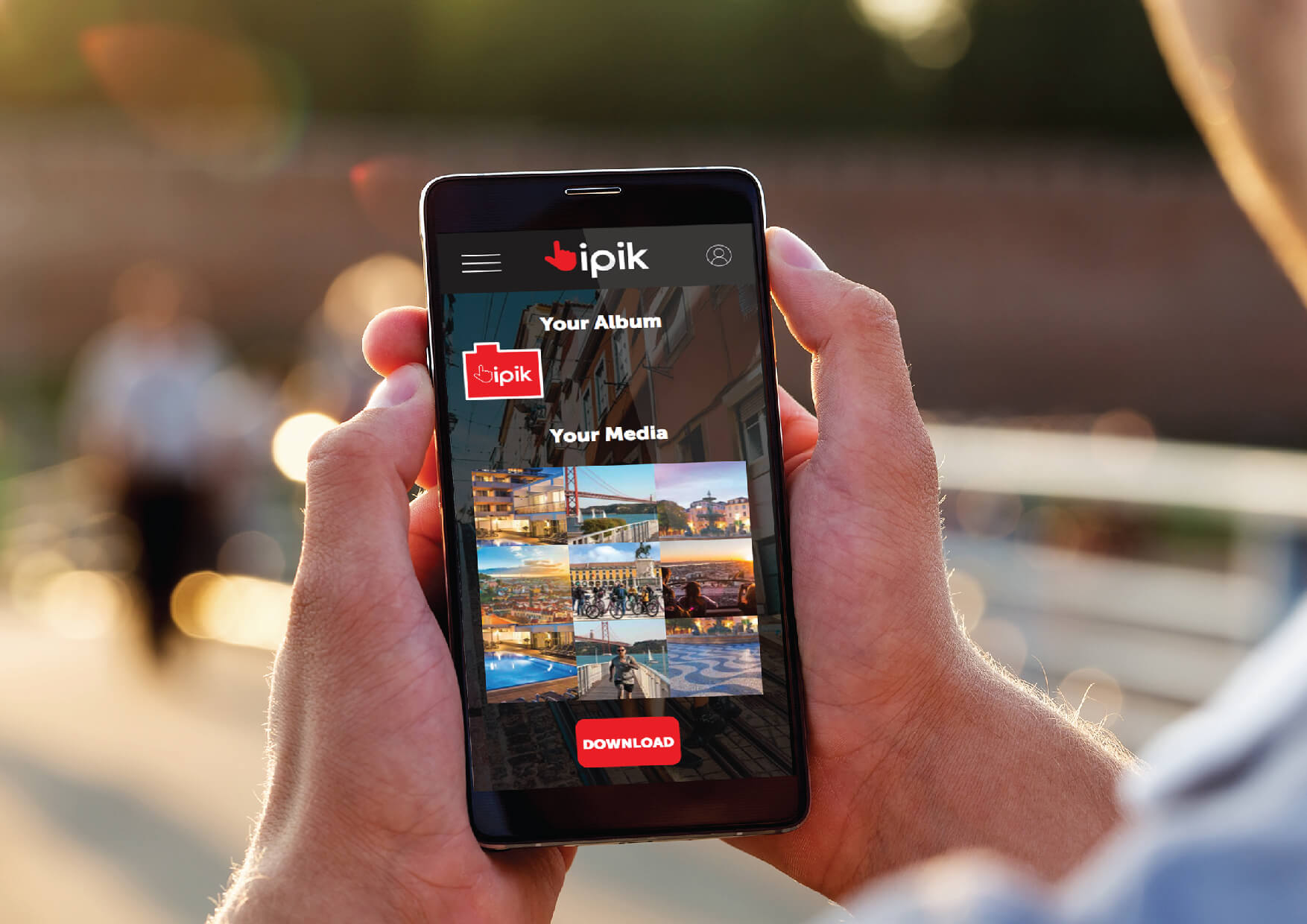
The design of the website interface was designed to be intuitive and inviting, incorporating large images that encourage exploration. Ease of navigation was a priority, ensuring that the platform is accessible to all types of users and devices.
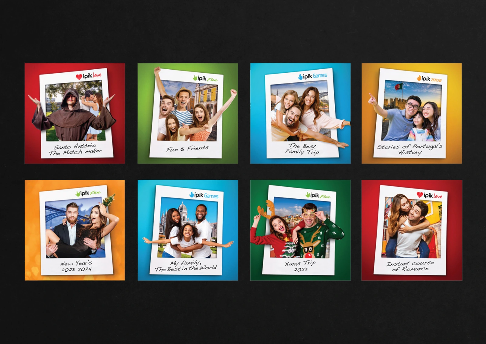
The image for social networks was focused on the use of polaroid images that symbolize the fun moments lived with ipik.